Button(按钮)
组件引入
import Button from "..."
组件功能
- 基础样式的修改
- 事件监听,按下、抬起、长按等事件处理
- 按钮布局,可以是图片按钮,也可以自定义按钮里的布局
- 加载动画
- 进度条的实现
Demo
基础按钮
    <Button
      title={"提交"}
      width={100}
      isRadius
      fontColor={'#fff'}
      backgroundColor={'#2FB98E'}
      onPress={()=>{
        // alert('0000')
      }}
    />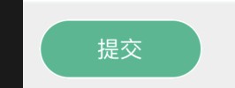
布局属性
    <Button
      type={"container"}
      textPosition={'right'}
      title={'ReactNative'}
      // imgStyle={{backgroundColor:'red'}}
      imgSource={{uri: 'https://reactnative.cn/img/header_logo.png'}}
      width={200}
      // isRadius
      fontColor={'#fff'}
      backgroundColor={'#2FB98E'}
      onPress={()=>{
        // alert('0000')
      }}
    />
进度条
    <Button
      title={'ReactNative'}
      isProgress
      progressNum={0.7}
      width={200}
      isRadius
      fontColor={'#fff'}
      backgroundColor={'#2FB98E'}
      onPress={()=>{
        // alert('0000')
      }}
    />
加载动画
    <Button
      title={'ReactNative'}
      loading
      loadingColor={"#fff"}
      loadingSize={"small"}
      isProgress
      progressNum={0.7}
      width={200}
      isRadius
      fontColor={'#fff'}
      backgroundColor={'#2FB98E'}
      onPress={()=>{
        // alert('0000')
      }}
    />
props
| Attribute | Description | Type | Accepted values | default |
|---|---|---|---|---|
| title | 按钮标题 | String | 按钮 | |
| type | 按钮类型 | String | text/img/container | text |
| fontColor | 文本颜色 | String | #fff | |
| fontSize | 文本字体大小 | Number | 14 | |
| backgroundColor | 按钮背景色 | String | ||
| width | 按钮最小宽度 | Number | ||
| isDisable | 是否禁用 | Boolean | false | |
| onPress | 点击事件 | Func | ||
| onLongPress | 长按触发 | Func | ||
| onPressIn | 按下触发 | Func | ||
| onPressOut | 抬起触发 | Func | ||
| style | 样式,设置此属性,会沉淀其他样式属性 | Obj | ||
| activeOpacity | 不透明度显示(0到1之间)。默认值为0.2 | Number | 0~1 | 0.2 |
| imgSource | 图片来源,当type为img或container时生效 | obj | ||
| imgStyle | 图片样式,当type为img或container时生效 | obj | ||
| imgResizeMode | 图片尺寸适配 | String | contain | |
| textPosition | 布局属性,当type为container时生效,以文字为定位源, | String | left、right、bottom、top; | left |
| slot | 插槽,自定义组件,当type为container时生效,与文字搭配, | |||
| loading | 是否加载动画 | boolean | false | |
| loadingColor | 加载动画颜色 | String | ||
| loadingSize | 加载圆圈大小 | Number | ||
| isProgress | 是否显示进度条 | boolean | ||
| progressNum | 进度系数,0~1 | Number | 0~1 | |
| height | 按钮最小高度 | Number | ||
| borderColor | 边框颜色 | String | ||
| borderWidth | 边框宽度 | Number | 1 | |
| isRadius | 是否有圆角 | Boolean | true |